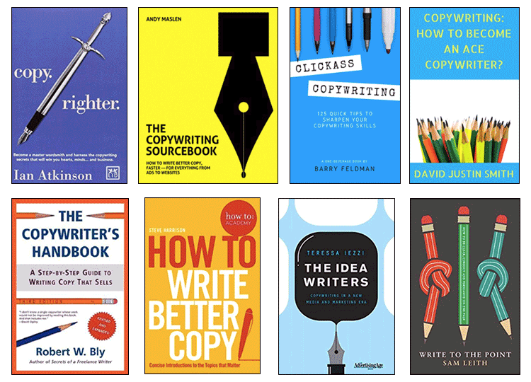
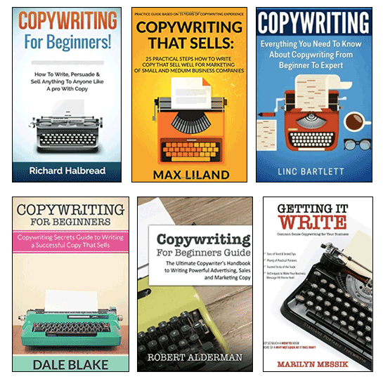
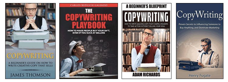
The story of a book cover
No pencils.
When I decided to self-publish my book, Copywriting Made Simple, I was absolutely determined that its cover would not feature pencils. Or pens. Or typewriters. In fact, no writing instruments of any kind.
Despite the saying, people really do judge books by their covers. Covers are to books as faces are to people. Think of a book you love and it’s the cover you see. The right cover captures the essence of a book perfectly, while the wrong one condemns it to misunderstanding or indifference.
Covers are visual, so we can appraise them instantly and instinctively (System 1 thinking, in psychologists’ jargon). In contrast, back-cover blurbs and reviews, while far more informative, demand some rational, evaluative effort from the reader (System 2 thinking). Judging by the cover is the road of least cognitive resistance.
Then there’s the nature of the book trade. Bookshop buyers, like all of us, are short of time, and must decide whether to stock a title based on a quick scan through an information sheet. To get past the gatekeeper, your book needs to look like it can outsell whatever is already on the shelves. Of course, you can bypass them and go to your readers direct – but only if your cover can stand out from the crowd online.
On top of those generic reasons, I had personal ones. Copywriting Made Simple was half commercial venture, half professional brand-building, half passion project. Writing it on my own had taken a whopping effort that I had no plans to repeat soon, if ever. For lots of reasons, I really wanted a cover I could be proud of.
So yeah, covers matter. And mine mattered because it was me. So why didn’t I want pencils on it?
Pen is mightier
First and foremost, I didn’t want to look like everybody else. My book was, at best, a competent synthesis of other people’s thoughts. But if I couldn’t be original, I could at least look original.
Plenty of authors far more talented and distinguished than me had writing implements on their covers. Maybe that was their choice. Or maybe their publishers had their own ideas of how a writing book should look. Whatever the reason, the result was a plethora of cover designs depicting the tools of the writer’s trade. At best, they were colourful synecdoches; at worst, they reduced marketing to handicraft.
Then there were the unwelcome parallels between penmanship and cockmanship. I didn’t want any implication, however Freudian, that I saw writing as some sort of masculine performance.
What’s more, there’s probably enough rigid certainty among male writers already. Instead of handing out prescriptive advice, I wanted to say that copywriters can always make a choice, or a compromise. Showing any sort of erect shaft – even that of a fountain pen – just didn’t seem to be in tune with that.
Keys to my heart
OK then, what about typewriters? It’s many years since I saw someone actually use one, and being old enough that I once had to use one, I’m not inclined to eulogise them. But they do have undeniable physical charm, and their very obsolescence gives them a certain hipster cred. They evoke the golden age of ad writing, or beat poetry, or something. And more profoundly, the letters arrayed on the keys give a sense of the as-yet-uncreated text: the many worlds within us when we sit down to write.
However, typewriters also turn writing into a job done on a machine: a stage on the marketing production line. They represent words enslaved by commerce. What’s more, they seem to play into received notions of the ‘feminine’, and particularly 1950s ideas of women in the workplace. Confined in their allotted role, typewriters remain passive, amenable and touchable, like a secretary out of Mad Men.
You might think that showing men using typewriters would offset that problem. Actually it just makes it worse, by transporting us into the realm of male competence porn. Just as men get to be chefs while women merely cook, so we manhandle the typewriter with the arrogance of entitlement. Look at the clever men, writing!
Thinking, talking and explaining
As well as these things to avoid, I had other things I wanted to achieve. Specifically, there were three ideas absent from most other covers that I really wanted to get across with mine.
The first was that copywriting is really copythinking. It’s not just a craft or skill; it’s an intellectual discipline. First, you need to work out who you’re talking to and what you want them to think, feel or do. To achieve your aim, you might need a creative idea that’s more conceptual than verbal. The actual wordwork, while certainly important, comes after.
Showing a human writer rather than an object would help. But it would still be a portrait of a lone auteur, an artist in a garret. The second thing I wanted to express is that copywriting is a conversation. The copywriter wants to reach as many people as they can, and make damn sure they get the message. While novelists, lyricists or poets might practise their art with no expectation of universal acclaim, or even comprehension, copywriters must only connect.
Finally, I wanted to show that copywriting is saying something about something. It’s not enough just to grab people’s attention, or dazzle them with your creativity. Your work must sell the product.
So my ideal design would express thinking, conversing and communicating. All at once, and with imagery alone. Was that possible?
Visual metaphor
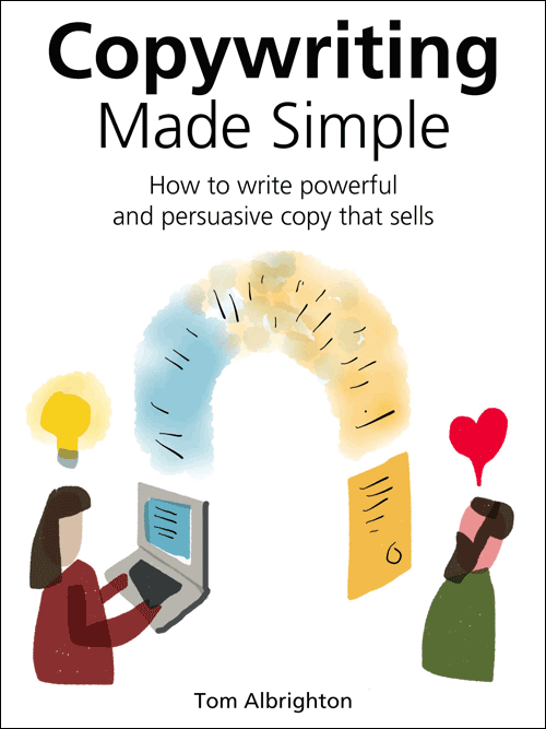
Clearly, what I needed was some sort of visual metaphor. I reasoned that it would have four elements: the copywriter, the reader, the product and its benefits. And it would need to show the relationship between them in a way that was instantly clear, even to the casual browser in a bookshop or online.
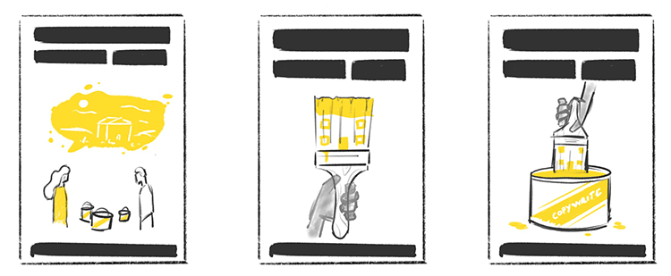
I grabbed my iPad, fired up Paper and gave it a go.
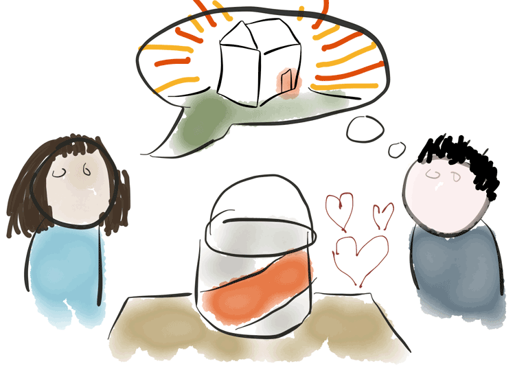
In my sketch, copywriting took the form of a literal, face-to-face conversation between copywriter and reader. On a table between them sat the physical product: a can of paint. The copywriter’s words expressed the benefits of the product: a colourful house. In the process, her speech formed the thoughts of the reader, who reacted positively (the hearts).
The customer is your husband
The genders of the two figures pretty much picked themselves. Two men or two women would obviously be unbalanced. Showing a male writer influencing a female reader felt a bit ‘the customer is your wife’ – not wrong as such, but enough to make me uneasy, particularly as a male author myself. And that unease would be intensified if the writer was expressing an idea (speaking, active, intellectual), while the reader was merely responding to it (listening, passive, emotional).
Also, as my examples above suggest, nearly all copywriting authors are male. Of course, I wasn’t helping there. But if my book couldn’t be by a female copywriter, it could at least show one.
However, there was a calculation here too. The well-known glass ceiling in advertising creative meant that my target audience – junior and aspirant copywriters – were more likely to be female themselves. There seemed little point alienating them right off the bat.
Getting in a Hoff
I liked the concept on an intellectual level. Now I needed someone who could make it work visually. Enter Ollie Hoff, a talented young illustrator based near me in Norwich who creates modern, abstract artwork for print and web, often inspired by popular culture such as TV drama and videogames.
For the cover, I knew I wanted strong colours and simple forms that would reflect my approach to the topic and make the cover eye-catching, even when reproduced as a tidgy JPEG on Amazon. I also liked the fact that many of Ollie’s human figures were stylised enough to be racially indeterminate.
Anxious to remain completely in command, I confirmed with Ollie that he was happy to work under my close direction. As I should have known from my own experience, that sort of arrangement can go badly wrong if the client overrates their own expertise. Nonetheless, Ollie listened politely to my brief and agreed to produce an initial sketch.
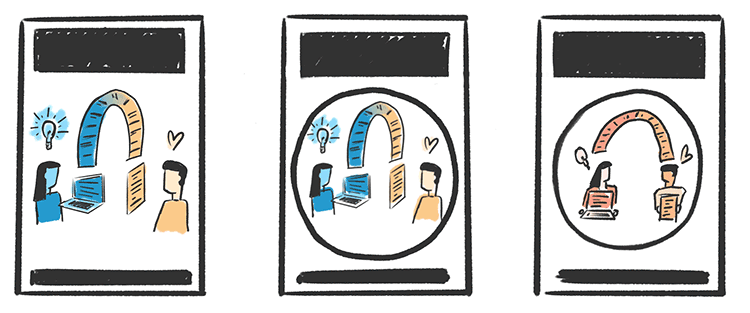
As Ollie’s second and third ideas show, he really wanted to boil the idea down to something far simpler and stronger – just the house and the paintbrush, with the copywriter’s agency expressed through a hand. If only I’d been listening, I would have changed course straight away. But all I could see was artwork that was showing the product and its benefits, but not the relationship between writer and reader. And that would never do.
Digging the hole deeper
Stubbornly, I decided that my original idea just needed work. The problem was that we were working too literally. Instead of depicting a tableau, we needed something more diagrammatic – a conceptual relationship between elements expressed through visual geometry.
I had another go.
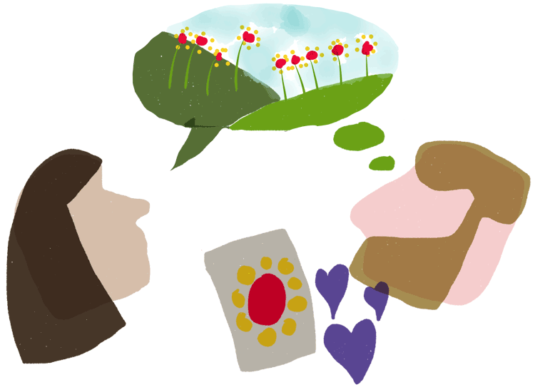
Anxious to demonstrate that paintbrushes per se were not the point, I switched to a new product: a packet of seeds, with the benefit being flowers. It seemed more visually fertile, with the added benefit of simplicity. And we didn’t need the table, or the bodies of the figures. Less was more.
Once again, Ollie dutifully went off and sketched his interpretation.
These sketches show Ollie valiantly trying to give my concept some sort of visual balance. But I still wasn’t really feeling it. Why wasn’t my idea – my kickass idea – coming together?
‘You could show it to some people you know,’ suggested Ollie. ‘That would give you a sense of how it’s working.’
It was an excellent idea. My friends and fellow writers Jo Tidball and Kevin Mills had each looked at the book text and provided valuable feedback. But as soon as I pictured them looking at the cover, I could hear their doubts and reservations in my head. It’s too complex. It’s not clear. What is it exactly?
I didn’t even need to get their views to see the writing on the wall. My confidence in the idea collapsed and I gave up on it.
Going backwards to move forward
I was back to square one. I’d wasted my own time and Ollie’s, and I was no further forward. It felt pretty depressing.
Fortunately, this was a classic case of a situation I’d written about in the book. Sometimes, the good ideas are over there, behind the bad ones. Once you ‘kill your darlings’ – that is, let go of ideas you’re over-attached to – the right answer emerges. At first, it seems too simple and obvious. But that’s a good sign that it will work.
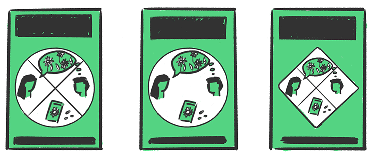
Almost immediately after I abandoned my first idea, a better one came through. Instead of trying to show everything and the kitchen sink, what if we just showed the copywriter writing, the reader reading and the words forming a link between them?
I went back to Ollie and said I wanted to try something clearer and simpler. ‘Clear and simple, that’s always good,’ he enthused – clearly relieved that he wouldn’t have to explain to me why my first idea was total shit. Credit where it’s due: I can see a point once it becomes blindingly obvious.
This time, I could feel Ollie’s optimism through his sketches. Instead of proposing alternatives, he was running with the concept, actively exploring how it could work. What if the figures were turned outward, so they faced us? What if they were ‘showing’ us what they were holding?
Now at last I felt confident to move to proper artwork. At this stage, the idea really came alive and ‘became itself’. Ollie worked up the writer and reader into detailed figures, set into an elegant triple-arched design (with pleasing echoes of Renaissance triptychs).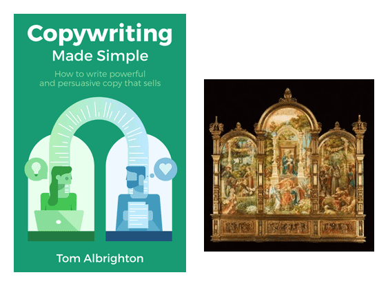
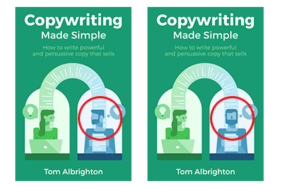
At first, the two figures were looking into each other’s eyes (below, left). I liked the symmetry, the inward pull and the sense of an intimate relationship. But with the reader thinking of a heart, it looked too much like they were madly in love. Better if he was looking at the words that were giving him the feels (below, right), to make it clear that this relationship was conducted indirectly, through the text.
The green shades felt rather cold and oceanic, so I asked Ollie to look at some alternative colour ways. He came up with four, and I settled on the gold as the winner. It made a nice contrast with the green and blue and had a positive, cheerful vibe.
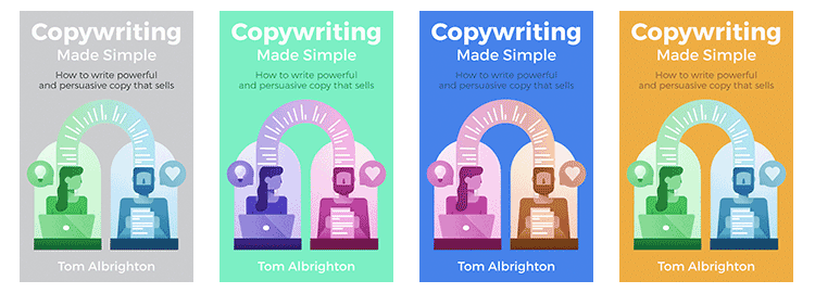
A little bit of typography and the cover was finished.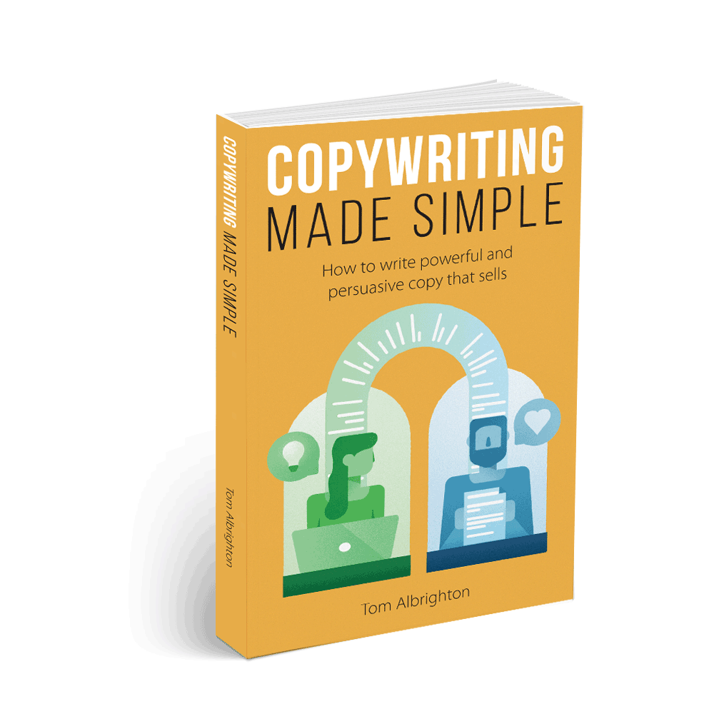
Lessons learned
I learned so much from working this project. As a freelancer, you inevitably work with some clients who find it hard to let go. That can be frustrating if you feel your expertise is being ignored, or that the client is ‘buying a dog but barking themselves’.
Once you’re on the other side of the fence, you see the other side of the story. You realise that what might seem obsessive or over-controlling is really just a deep, desperate desire for the project to come out right. You feel this constant, gnawing anxiety that the work must fulfil its potential – a potential that only you can truly appreciate, because only you can see it. Every step forward, every turn in the path, feels both momentous and irrevocable. This work, this moment, will never come again, and you will live with the results for ever.
When you’ve created something on your own, it’s hard to accept someone else’s ideas about it. But in the end, you can’t move forward without them. Hold on tightly, let go lightly…
- Thanks to Ollie Hoff for permission to use his work-in-progress sketches in this post.