Meta copywriting: brilliant but risky
This brilliant metatextual ad by Orbis (see image/caption below) uses typography and design to make a point about the service (investment research). In an industry plagued by bland messages and weak metaphors, it’s a masterstroke.
The genius is that while everyone will indeed read the headline, practically everyone will read the body too – because the headline is so compelling. So in fact, every reader gets the sense of being clever and special. What looks divisive at first sight is actually universal.
However, that brilliance comes at a price.
In my book, I argue that creativity has three sides: originality, wit and emotion. This approach goes all in on the first two, but leaves the third rather neglected. So the copy lives very much in the reader’s head, not their heart. They get some intellectual gratification – a ‘smile in the mind’ – but that’s it.
There’s also a kind of hollowness, or insubstantiality. The more your copy is about itself, the less it’s about something else. So there’s a risk that you don’t give the reader any vivid pictures, objects or stories to take away.
You can read more about meta copywriting in chapter 9 of Copywriting Made Simple.
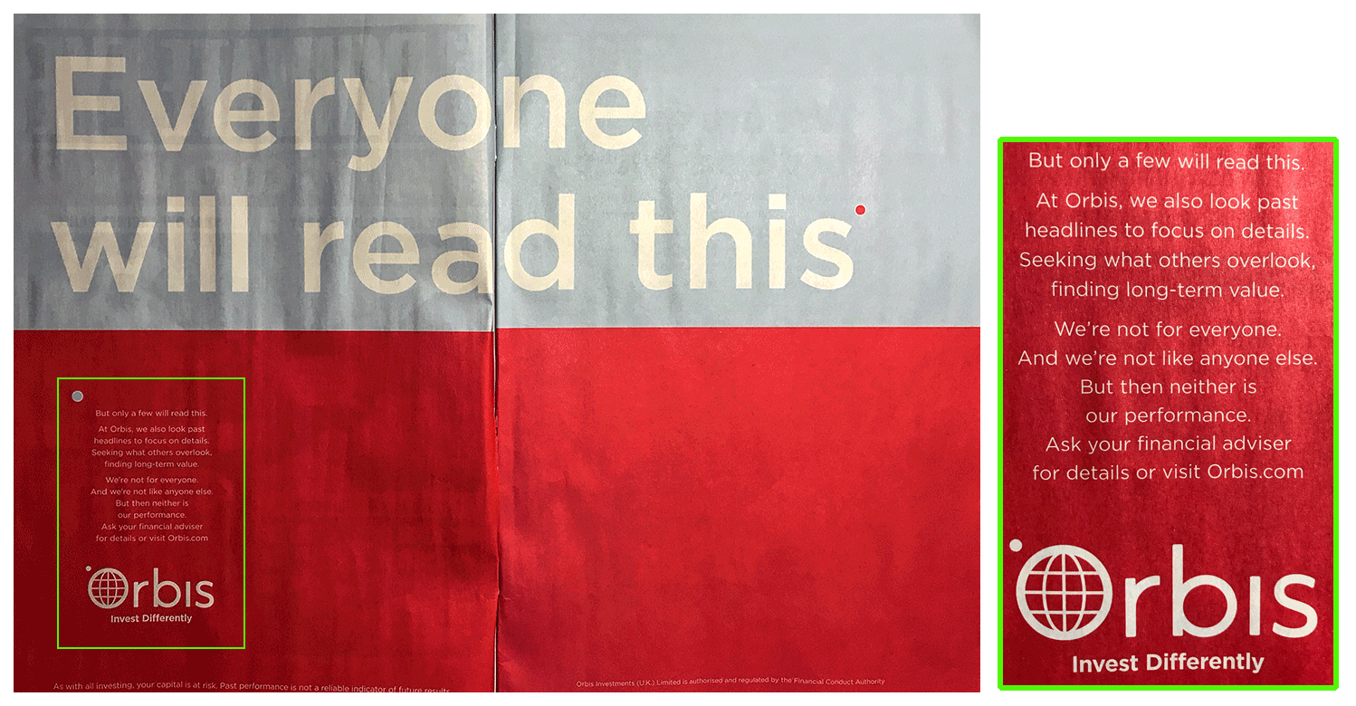
Caption for screen readers
Headline (in massive type) reads:
Everyone will read this
Body copy (in much smaller type) reads:
But only a few will read this. At Orbis, we also look past headlines to focus on details. Seeking what others overlook, finding long-term value.
We’re not for everyone. And we’re not like anyone else. But then neither is our performance. Ask your financial advisor for details or visit [URL].