Evolution of a freelance website
I don’t indulge myself on this blog. You’ll search in vain for holiday reminiscences, album reviews or little vignettes about my lovely daughter. So perhaps I can be allowed a single post’s worth of navel-gazing, as I trace the evolution of my website over the last eight years or so. And if you’re a freelance thinking about setting up a site for yourself, perhaps you’ll find something useful here. (Click the images to see full-size screenshots.)
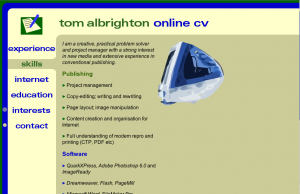
Stage 1
I build this site while still an employee, thinking of using it to find another job. It’s a simple online cv, but the graphics are animated in Flash. Although the design is lamentable, you have to bear in mind that this was developed around 2000 – lots of sites looked a lot worse than they do now.
The basic problem here – one that I wouldn’t solve for several years – is wanting to show off my feeble web skills rather than offer information in a way potential employers might actually like.
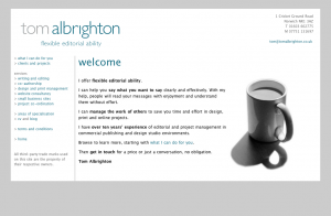
Stage 2
Freshly redundant, I create this site as a way to showcase my skills to potential freelance clients. The cyan and grey identity is done for me by a designer friend. Unfortunately the design I build around it is spindly, meek and rather self-effacing – reflecting my level of confidence at the time.
At this stage, I’m trading under my own name: this site was at the URL tomalbrighton.co.uk. (I think my reasoning was that success would be about selling my skills and building personal reputation.)
It’s still essentially a cv site, with none of the marketing copy you’d expect from a commercially minded freelance. Although I have given myself a tagline, ‘flexible editorial ability’ – I remember my sister laughing out loud at ‘flexible’, presumably because it evoked a circus contortionist.
The word ‘editorial’ shows that I’m still thinking of my skills in terms of the job descriptions I’ve had in publishing, rather than the words that potential clients might use to find someone like me. Lacking agency experience, I don’t yet feel I can use the word ‘copywriter’ to describe myself. Similarly, the ‘services’ are actually my own skill areas, rather than things a client might actually need done.
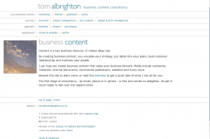
Stage 3
A slight improvement in design and a new tagline: ‘business content consultancy’, with a theme to match. I’m edging towards saying something clients might want to hear, but I’m still constrained by self-limiting beliefs about the applicability of my skills. Three self-indulgent pages on my ‘approach’ add nothing.
There are many more businesses calling themselves ‘content consultants’ these days, but I’m sure they all suffer from the same problem: ‘consultant’ sounds like someone who doesn’t do anything.
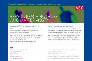
Stage 4
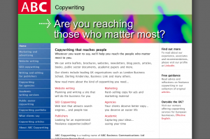
A new day dawns. I’ve now incorporated as a company – ABC Business Communications – and moved into a rented office. Having gained clients and confidence, my dream is to build my business up into an agency. (It never came true – or hasn’t yet.)
I’ve got a new logo (by the same designer) and some corporate colours, deployed to reasonably strong effect on this site. Unfortunately the domain I’ve chosen – abcbusiness.biz – is an absolute stinker. But I’ve still come on a lot since stage 1.
I’ve written a new tagline, ‘Are you reaching those who matter most?’ It’s not bad, but I’m not sure I’d use a question these days. It leads the reader into introspection and uncertainty, not clarity and action.
I even have some leaflets designed with this tagline and some more stock imagery. Nowadays I’d spend that kind of money on AdWords clicks rather than printed collateral – and I advise most sole-trader clients the same.
Stage 5
Now we’re cooking. I’ve finally woken up to the fact that, whatever my experience, potential clients use the word ‘copywriter’ to describe what I do. So I’ve adopted the trading name ‘ABC Copywriting’, got a new domain (this one) and built a new site.
Delighted at my discovery of <div> tags, I’ve built something that looks like it’s made from children’s building blocks. But at least it’s interesting, and shows signs of wanting to conduct visitors through information to an actual enquiry. It’s also the first site built with SEO in mind, and gratifyingly hits #1 for ‘copywriter norwich’ as soon as it’s spidered.
I’m still using the same tagline, but it’s woven into the copy much more tightly. If you’re going to use a headline, your copy needs to make good on its promise (or answer the question that it asks).
Stage 6
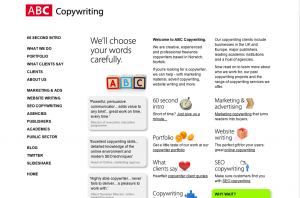
Boo-ya! How ya like me now baby? This is the first iteration of ABC Copywriting I’m really happy with; the first that looks and feels genuinely professional.
I’ve cleared out the solid colours and adopted a simple, flexible four-column layout (4x200px = 800px wide in total). White space gives a more relaxed feel, so visitors don’t feel so hemmed in by lines and blocks. Only the cutesy photographic images spoil the party – but imagery is a problem for almost every B2B site.
There’s another new tagline – ‘We’ll choose your words carefully’. It retains the second-person focus with ‘your’, but integrates some implication of skill on my part (which its predecessor didn’t). I’m still too close to it to tell whether it’s any good – you decide. The owner of a very reputable Norwich creative agency told me he liked it, and that’s good enough for me.
My blog’s appeared, but at this stage it’s still using an off-the-shelf theme (iBlog), so moving to the blog means encountering a completely different design style. It might as well be on a different domain.
Stage 7
Although I had a lot of enquiries with the site looking like this, I now regard it as a mis-step.
I feel the previous site is too self-effacing and discreet, so I make the home page different from the rest of the site and add these shouty all-caps headings to get in visitors’ faces a bit more. I also add a forceful (perhaps over-forceful) call to action, top right.
I scrap the imagery, realising that it serves no semiotic or cognitive purpose and also wanting to make a point about communicating only with words. But the end result is a bit obtuse and blocky, and arguably too copy-heavy too. In six months I will be itching to rework it again.
The biggest step forward at this stage is getting a custom theme built for my blog, so the WordPress pages have the same look as the main site.
Stage 8
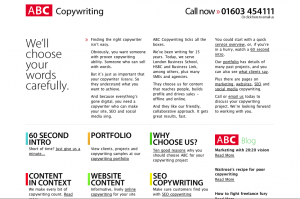
You’re looking at it! I finally started looking at sites I really liked and thinking about how I could use those ideas on my own site. I’m not a designer, so I played it safe and kept things ultra-simple, ranged left, with lots of white space.
The 4x200px column layout is still here, but I’ve moved the navigation up top to make more room for content – such as the ‘Read more’/‘Where to go next’ column on the right, which aims to keep visitors on the site a little longer.
We’re back to icons again, but the design was just too dry without them. The ‘marker pen’ style just adds a touch of warmth and softness that acres of Helvetica can’t quite deliver.
The home page is much more tightly constructed, with the tagline, lead paragraphs and icon working together on the theme ‘words people love’. Time will tell whether this works better than previous iterations.
The blog theme is updated too, with more thought put into how lists of posts will look and a better home page. Also, the blog is more tightly integrated into the main site, with links from service pages to relevant articles. The aim is to build an impression of authority – I don’t really expect potential clients to wade through dozens of blog posts.
And that’s the end of the story – for now, at least. Your comments are welcome, but whatever you do, please don’t say you like an earlier version better than this one. It took me ages…
Comments (8)
Comments are closed.
It looks great – very easy to get around, nice imagery, clear layout. You should be very pleased.
It’s also really interesting to see the development of both your site and your thinking about your business. It’s comforting to know that you’ve wrestled with some of the same issues I have!
Really nice clean layout Tom. I agree there was a big jump to stage 6 which I think really begins to reflect your expertise in displaying your skills and service – the written word.
Be interesting to see how long it lasts before you continue the evolution cycle, as a website should evolve as you learn what what works best for your business and how potential clients use the site. Think I need to revisit mine.
[…] This post was mentioned on Twitter by Tom Albrighton and sue jeffels, Richard Hollins. Richard Hollins said: I found this really interesting RT @ABC_Copywriting: New post: Evolution of a freelance website http://goo.gl/fb/K6RSb […]
Fascinating evolution. Good luck with your new site. I especially like your 60 second intro video.
Hello,
I’m a young italian girl trying so hard to learn as much as possible from the copywriting world. I just started my own blog or web site ( I dont know how to call it yet) and I really don’t know where to start from. I found your post very usefull and precious for my need of information and knowledge. I really like how your website looks righ now even if being completely honest I liked it more at step 6 for the icons and ABC imagine like a baby toy. But at the same time I think that the current web site has a better tagline. I don’t know if it can be usefull for you, but for sure it will be nice for you to hear that you helped me a lot.
Hi Alessia. I’m glad you liked the post. A lot of people liked the pictures at step 6, but in the end I felt they were just too frivolous. Everyone has their own taste I guess…
Truly inspiring! I´am Lucia, a copywriter from El Salvador. I´am a fan of yours since a year ago! Thank you for sharing this evolution!
Thanks for the kind words!