Copywriting for sale
I recounted in my last post how ideas often come to me while running. Well, sure enough, one did the other day. To wit: why don’t estate agents do more with ‘for sale’ signs?
Here’s one from a leading local agent, William H. Brown, which is typical of the style.
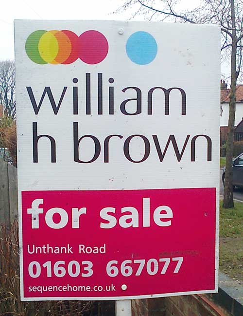
As a piece of marketing material, this could hardly be more basic. It indicates that the property is for sale, identifies the estate agent involved and, by including a phone number and/or URL, issues an implicit call to action to those interested in finding out more. And that’s it.
What it doesn’t do is convey any information about the product being sold. At this stage, all prospective buyers have to go on is the location (which is crucial, of course) and the look of the property from outside. If pimping your crib on the street has any value, it’s surely worth throwing the passing punter a bit more of a bone – not to mention hitting them with a more in-your-face call to action.
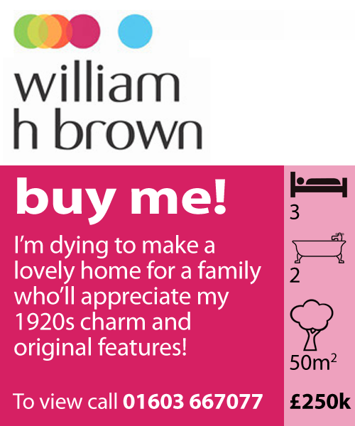
Here’s an attempt at doing just that (completely unofficial, see disclaimer below):
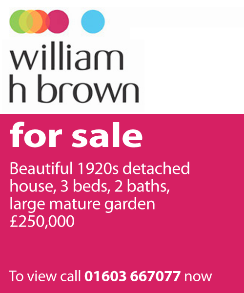
Now, you’re probably thinking that the average seller won’t want that stuff publicly on display – particularly their asking price. But all this data is freely available at the agent’s office, in the local paper and, most immediately of all, online. Interested house-hunters with smartphones can be looking at the info in seconds, even while they’re standing outside the property. So why put them to the trouble when you can use the features to draw them in at the outset?
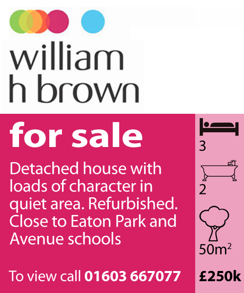
Furthermore, with a little sprinkling of information design, we can communicate the key facts more economically, leaving more graphical real estate free to describe other features that might be more attractive to buyers:
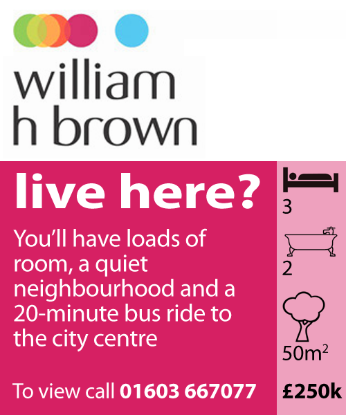
Now, as any copywriter will tell you, benefits are more powerful than features – you should always sell the sizzle rather than the sausage. In this context, I’d suggest that means giving the audience a vivid picture of what it would be like to live in the property. Because we’re not selling a house here, we’re selling a lifestyle. So a more adventurous version might look like this:
But why stop there? Once this approach becomes industry standard, as it surely will, a bog-standard tone of voice will no longer cut through. Forward-thinking estate agents will want to stand out from the crowd – and what better way to do that than with some Innocent-style wackywriting?
OK, that might be a step too far, but you take the point. With just a little extra cost and effort, these signs could be working a whole lot harder to close a sale. Estate agents, put your house in order!
- The images in this post are for entertainment only. They have no official connection with William H. Brown and were not commissioned, approved or endorsed by them. No copyright infringement intended.
- A French translation of this post appears at Stereotexte.
Comments (15)
Comments are closed.
Interesting you decided to remove the URL. I’ve seen boards with QR codes (a little too far IMO) but an easy way to view the house details online would be great.
Given you have to be next to the house/area to see the sign details of the location may not be as useful as the features of the house, but I completely agree that the ‘For Sale’ board has the potential for much more.
It wasn’t a conscious decision to remove the URL, although it the sign provided enough info, it might be better to push the reader towards a viewing rather than allowing their interest to dissipate as they browse other properties on a website.
There’s also the question of the UX delivered by the URL in question. I’ve tried to search by postcode for properties I know are for sale in my area and found that the search functionality was inferior, so I ended up frustrated. If the website can’t convert, it might be better to push the reader down traditional channels.
I saw a great one a while ago – it was on the outskirts of a small town that sits on New Zealand’s main state highway, and gets a huge amount of through traffic from people on very long trips.
It said: ‘If you lived here, you’d be home by now.’
You had me up until the “wackywriting” example. That one made me want to burn the house down instead.
Some estate agents are also introducing NFC tags into the boards which transfer information direct to your smartphone – just like tapping your Oystercard on the London Underground.
You’d remember it, though, wouldn’t you?
One issue is that these signs are put up by a third party not the estate agent so first you have the cost of custom printing then next you have the issue of the idiot man in a van putting the wrong sign up. The side bar is a great idea and with stickers for the numbers could be done without trouble.
A large URL with maybe a 4/5 digit property code might be better than a QR code
Interesting. I’ve wondered for years why they don’t include the price on the board. It’s the equivalent of putting a ‘for sale’ sign in a used car with a mobile number but no price. i did see a To Let sign recently that changed to Too Late! when rented.
Regarding the cost, I’ve just called Hussey Knights, a local repro/printing firm, and they informed me that printing a one-off double-sided Corex board of the type used by estate agents, in full colour, would cost £25 + VAT.
On top of that, you’ve got the cost of producing the copy and updating the design, neither of which should be prohibitive.
Let’s call it £100 tops for the whole thing, which hardly seems a fortune in the context of a fee that’s 1.8% of the sale price (i.e. £4500 on a £250k property).
OK, not every property that is marketed ends up being sold, but still. You could also do it selectively, e.g. for properties that were not shifting.
Printing the full address on the board would be one way to help the idiot van man, as well as confirming to viewers that they’d definitely arrived at the right place.
Oh I think there is a lot of mileage in the idea certainly if the sidebar can be harmonised across estate agents to give a standard language.
Worst client I’ve ever had was an estate agent a few years ago. One of the ideas I put forward was ‘useful signs’ with icons for things like number of bedrooms and a ‘USP’ tagline on each sign. Needless to say we never did it. We never did most of the things I recommended which is why we parted ways as “I didn’t achieve much” – not surprising as they didn’t agree to anything!
My first thoughts were of the expense of industrialised boards per every property, but then in our core business of lettings we will always use the board again so it’s a maybe from me?
Hi Tom. This must be the first post I’ve even read about writing a real estate sign. I’ll email it to one of my real estate clients. Thanks.
Well, I hope they take the idea up. I really do think it’s a missed opportunity.
I really like the suggested designs, especially with the icons. Do you know if anywhere has ever adopted them?
I had a similar frustration recently when putting my flat up for sale, but not with the board, rather the estate agents’s discription of the property, which is not particularly inspiring.
I can understand agents being constrained to remaining impartial and not misdescribing a property, but the descriptions are so dull that nothing makes one really stand out from another. Couple that with the formulaic estage agent speak and it’s just a recipe for yawns.
So I did my own blog post version, and the last version of your boards is probably similar to the tone I was going for with this – obviously over-exaggerated for the Buzzfeed generation http://www.thewordman.co.uk/28-reasons-to-buy-12-swan-court/