Healthy copywriting from 38 Degrees
I’m not sure I understand the coalition’s health reforms. But I’m sure I don’t like them. So I was pleased to see that the new poster campaign from 38 Degrees, opposing the reforms, was so well written. (The creative is by other.)
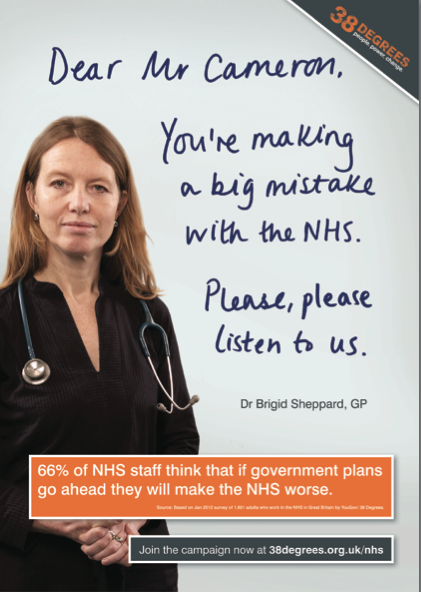
Ostensibly, the text of the poster is a direct quote from Dr Brigid Sheppard. If it is, she’s missed her vocation, because this copy is healthier than a GP’s bank balance.
Dear Mr Cameron,
You’re making a big mistake with the NHS.
Please, please listen to us.
First off, the salutation makes it clear that the campaign regards David Cameron, rather than Andrew Lansley, as the author of the NHS reforms. We’re talking to the organ-grinder, not the monkey. Going over Lansley’s head pre-empts any move to hang him out to dry (which has looked more than likely, many times) and appoint a new patsy to make cosmetic tweaks and push the reforms through regardless.
 Using ‘Mr’ makes the whole thing seem polite and reasonable, in a way that ‘Dear David Cameron’ wouldn’t. This is no class-war bolshevik rant, just one professional writing to another.
‘You’re making a big mistake’ is inspired. This line could easily have been something much more inert and passive like ‘These reforms will damage the NHS’. The underlying meaning is the same, but framing it as a direct assertion in the second person is dynamite.
The use of a colloquial expression like ‘making a big mistake’ makes the sentiment sound like it’s just common sense – something that anyone could agree with. Again, something dry about ‘misguided reforms’ or similar just wouldn’t pack the same punch. ‘Big mistake’ is the perfect way to describe a momentous, irrevocable and ultimately ill-advised decision.
Please please me
‘Please, please listen to us’ ramps up the emotion on both sides of the argument. First, the repeated ‘please’ positions NHS professionals as put-upon martyrs pleading on behalf of the people. Secondly, ‘listen to us’ subtly paints Cameron and his government as heedless tyrants, ploughing on with their market-based madness with utter disregard for the human cost. What sort of man doesn’t listen to a nice lady doctor?
Because it’s a quote from a real doctor (or purports to be), the whole thing has the persuasive power of authority – it’s not a marketing agency saying this, but someone who understands the reforms and their impact. The powerful ‘66%’ statistic adds evidential ballast to Dr Sheppard’s personal view. (You shouldn’t really start a sentence with a numeral, but we’ll let that slide.)
Such hard-hitting copy doesn’t need a lot of visual clevering off, and it doesn’t get it. The (genuine?) handwriting tells us that these are Dr Sheppard’s own words, while a simple grey and orange colour way ensures that she is by far the warmest thing in our field of vision.
Dark clothing is always powerful, and the direct look to camera conveys sincerity, honesty and concern. The clasped hands may give Dr Sheppard a faint air of supplication, but showing knuckles projects confidence and strength. And just in case we were in any doubt over who to trust, that stethoscope puts us right in her surgery, waiting for her to reassure us about our persistent cough.
Airbrush with fate
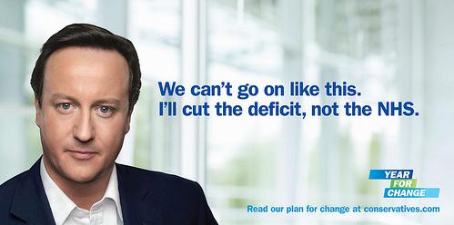
Compare that with the Conservatives’ famous campaign poster for the 2010 general election, which featured Cameron himself ‘saying’ the following lines:
We can’t go on like this.
I’ll cut the deficit, not the NHS.
Having championed colloquial language, I can’t fault the first part. However, it’s worth noting that this is knocking copy – critcising Labour, rather than proposing an alternative. A more positive version would be something like ‘There is a better way’. But as the coalition’s sorry-assed first term has shown, the ‘Blame Labour’ tactic is a gift that just keeps on giving. (To be fair, ‘read our plan for change’ at the foot of the poster does at least hint at something more positive.)
The second part – ‘I’ll cut the deficit, not the NHS’ is semantically a bit awkward. By setting up a diametric contrast between cutting the deficit and cutting the NHS, it (a) suggests that they are mutually exclusive opposites and (b) implies that Labour was doing the converse of what’s proposed – that is, cutting the NHS as opposed to the deficit. But if anything, it wasn’t cutting either – that was the whole problem.
Presumably, the final copy was the ultra-punchy, ultra-condensed version of a longer, wordier version – something like ‘I’ll cut the deficit without cutting the NHS’. If so, the longer version would have been clearer. But perhaps it was felt that actually using the phrase ‘cutting the NHS’ was just too toxic, even as part of a denial.
The ludicrous artwork, rightly derided, makes liberal use of Photoshop airbrushing to magic away Cameron’s forehead wrinkles. But the only effect is to make his face look like a shop-bought pie, instead of one you made at home. How did it ever get signed off?
Well, I’ve spent the whole post focusing on style over substance, and I’m no closer to an informed opinion on the NHS. But at least I know which one of these posters I believe. How about you?
Comments (3)
Comments are closed.

Thanks for your analysis – very interesting and quite spot-on. Just for the record, the campaign is by other creative so it would be great to credit us for the work. Many thanks.
@Sam
Thanks for your comment. I have now added a credit to the post. I did try to find out who had done the work but without success.
I assumed they went with that line because the original version wouldn’t have got past the ASA:
I’ll cut the deficit and f**k the NHS.