The colour of sound
Just before Christmas, I was struck by this poster for Beats Solo headphones, created by R/GA. I think it’s brilliant, but when I said so on Twitter, few people agreed. So in this post I’d like to give reasons for my answer, O-level comprehension style.
I think this ad targets teenagers, or young people at least. That’s slightly at odds with the nature of the product, which retails at £169.95 and is, by all accounts, a reasonable bit of kit. But the content of the ad itself looks like a straight-out pitch for the youth market.
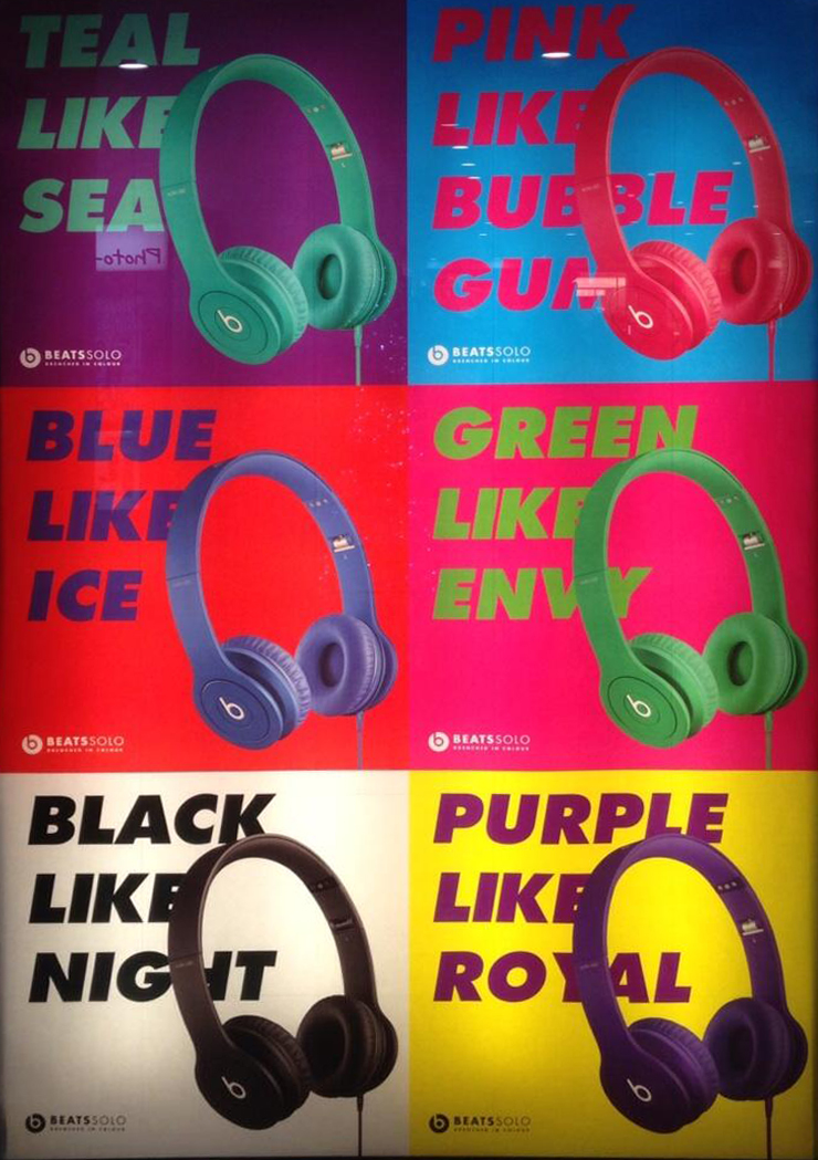
Let’s unpack the elements, starting with the design. The regular grid and bright colours serve the same purpose that they did in the art of Andy Warhol: to foreground the essence of commodified, manufactured products we take for granted, and make us see them with fresh eyes. There’s no attempt to bring the enjoyment of music into the picture. In visual terms, this is headphones as pure accessory, which is perhaps how younger customers see them – after all, they’re just as visible as glasses, earrings or anything else you might wear on your head.
The uniformity of the layout, coupled with the variation of the colours, harmonises nicely with young people’s desire for what we might call ‘difference in sameness’.
Researchers have found that teenagers define their identities with a very finely judged combination of fitting in and standing out. Many of their choices in terms of music, fashion and lifestyle are conformist, expressing their membership of a group or response to peer pressure. But they’ll usually introduce a little twist or variation of their own that expresses their individual identity. So when you see two or three teenagers who seem to be dressed ‘identically’, if you look closer, you’ll often see little details chosen precisely because they don’t fit in.
The Beats Solo ad keys directly into this. ‘These headphones are so cool, all your friends are going to buy them too,’ it says. ‘But even if they do, there’s still a way for you to express who you are, by choosing a colour that reflects your personality.’
However, when the copy drops, it takes this benefit and turns it up to 11. Reading through the grid, we initially think we’re going to get a simple set of ‘[colour] like [thing]’ comparisons. But ‘envy’ is a feeling, not a thing, and ‘royal’ is another adjective, which completely skews the sense. This deliberate imprecision gives the language a vague, allusive quality, like a song lyric, and it has a much deeper emotional resonance as a result.
The vehicles of the similes could be real-world things. But more poetically, they could be lyrics (‘Royals’, ‘Back to Black’), moods (whether musical or personal) or even character attributes. The overall effect is to evoke the chaotic confluence of ‘who I am’, ‘how I feel’ and ‘the music I hear’ that takes place in the young head between the headphones.
The only bum note is ‘teal’, which feels like an intruder from a Littlewoods catalogue rather than a Twin Shadow lyric. We can only assume that, with ‘blue’ and ‘green’ already taken, this was the least worst option, with ‘turquoise’ regarded as even worse than ‘teal’.
Overall, I think it’s a really imaginative response to a brief that could easily have led to to either predictable ‘youth lifestyle’ territory or the creative bankruptcy of an endorsement from ‘creator’ Dr Dre. Great work.
Comments (7)
Comments are closed.
I think it’s good too, but can’t help but wonder if we’re missing some cultural reference on the teal-seal front. Perhaps we can track down the copywriter and find out…
Maybe! I’ve just tweeted this at the @RGA account so maybe they’ll comment…
Is it Teal Like Seal or Teal Like Sea?
Lots of people have said that. I think it’s Teal Like Sea. Seals aren’t teal, and nor is Seal.
I suppose the question is this. Do seals like tea?
‘This deliberate imprecision gives the language a vague, allusive quality, like a song lyric, and it has a much deeper emotional resonance as a result’. The writer of the ad is probably saying to him or herself ‘I thought I wrote ‘purple like royal’ ‘cos I couldn’t think of anything purple, but now you come to mention it, yeah, it was all about the allusive qualities of the wossnims.’
I’ve just seen this post and remembered the campaign – seeing it on a bus shelter, as I drove past on a bus – and still wonder…”do I actually get it, or am I missing something?”
I was slightly befuddled by the use of language and layout of the creative. It left me with a rather flat feeling, instead of excitement.
Bearing in mind the audience, who I agree are the younger entrants into the ‘premium headphone market’, should there not be more ‘pop’ or emotive resonance with the ad and the brand. My feeling is the brand delivers on the emotion, but the creative leaves you feeling a bit lacklustre.
Shouldn’t similes turn the wheels of your imagination? Loosen the cogs and get you excited. Music does.
I suppose thinking about it, I don’t buy into the colour thing. It feels a little ‘done’, and I think kids wanting to pay £150 for headphones want theirs to be personalised. Take Nike for example, who allowed personalisation and experience to come together in-store.
The only one I am intrigued by is “Purple like Royal” – now that delivers.
So I’m going to keep taking a look at the creative, and see if I get it. Maybe it’s a grower!